Signage Systems & Information Graphics – A Professional Sourcebook

Colour Language

Red is the most eye-catching colour and therefore communicates the most important information, allowing someone who is in a hurry to ignore other notices,

Colours have certain cultural and historical associations, although these can differ vastly in different countries around the world.

In airport wayfinding systems, you will often see black lettering on a yellow background. This is because yellow is known to attract attention, and black lettering on luminous yellow is easy to read.

In the United States, emergency exit signs are usually white with the word ‘EXIT’ in red or green, whereas in Europe they are green with white lettering or pictograms. Would it make sense for them to be standardized? In Germany, motorway signs are blue and ordinary road signs are yellow, while in Switzerland and Italy the former are green and the latter are blue. So which colour should be used for which purpose? There are practically no colours left for standardization, and in any case uniformity would surely mean cultural impoverishment.

Image

Pictograms

For the Munich Olympic Games in 1972, Otl Aicher and Gerhard Joksch designed a system of pictograms that is still in use today. Visually, it has retained a sleek, modern look with its clear, faultless representation of forms and figures. Notice, for instance, how to smoke curls up from the cigarette, swirling from between the ash and the stem and not, as in so many poor imitations, above the ash itself.

Uebele, A. (2007) Signage systems & information graphics: a professional sourcebook. London: Thames & Hudson Ltd

Graphic Design in Context: Typography

The Universal Symbol Sign system functions to identify places and services in airports, hospitals, and other public places. Whether a symbol points the way to a cash machine, a fire extinguisher, or a place to eat, it communicates in the same visual language as all the symbols within the system so that readers will interpret each as the same kind of identifier.

x10

Universal healthcare symbols, 2010. Society for Environmental Graphic Design.

Whether a person is in Istanbul or Quebec, he will be able to spot the men’s bathroom because the featureless silhouette of a figure (sometimes called the popsicle man) stands near the door. Today this language is ubiquitous and therefore understood by people around the globe.

Road signs are less universal. Their visual attributes and abstract forms tend to differ from region to region. Still, within a given state or country this system is consistent. If every symbol was a different weight, color, and shape, how would drivers distinguish a Stop sign from every other bit of information blaring at them in the environment? The answer is obvious: they wouldn’t.


Crisp, D.G. (2012) Graphic design in context: typography. London: Thames & Hudson Ltd.

Graphic Design in Context: Graphic Design Theory by Meredith Davis

The most basic unit of representation is the SIGN, which is something that stands for something else to someone in some respect. For example, C-O-W is a linguistic sign. There is consensus among speakers of English that this combination of letters and the sounds associated with them stand for a large farm animal that gives milk. A soldier who salutes with his or her right hand is also a sign: there is a common understanding in many cultures that this gesture signifies respect for those of higher rank among members of the military. And a red cross composed of two intersecting lines of equal length and width is a sign. In non-Arab countries, this symbol stands for a politically neutral organization dedicated to emergency relief in times of war or disaster.

x9

RED CROSS, RED CRESCENT, AND RED CRYSTAL, 2007
International Federation of Red Cross and Red Crescent Sociaties

All three symbols stand for a neutral organization that provides relief in times of war or disaster. The relationship between this meaning and each of the three forms is arbitrary. There is no meaning inherent in the cross, crescent, or diamond; significance is established solely through their use in cultural practice. Three different identities are necessary because various countries associate the symbols with ideas unrelated to the organization’s work.


The Context of Culture

Says Hall, we would be able to communicate through entirely private languages. We would simply decide that a sign stands for something (a circle for childhood, for example) and that everyone, without explanation or education, would instantly understand the association of the sign with this idea.


Categorization

Eleanor Rosch, a psychologist at the University of California, Berkeley, use the concept of categorization in their work. Categorization allows us to think and communicate metaphorically.

The desktop metaphor, for example, enables us to communicate intuitively with the operating system of our computers. For example, our knowledge of the behavior associated with a file allows us to execute certain computer operations without reflection. We intuit from past experience the difference between a file and a folder, recognizing that the former is information and the latter is a container.


Davis, M. (2012) Graphic design in context: graphic design theory. London: Thames & Hudson Ltd.

Sustainable Graphic Design

Encoding the Message

A place to start is to consider what the human visual system can decode as the message of the graphic. In this way, the graphic artist does not use a technique to encode a message that the viewer’s visual system cannot extract from the graphic.

The visual system can decide information from these aspects of a static environment:

– Shape

– Intensity (contrast)

– Color

– Size

– Distance

A person can visually extract information about absolute quantities from each of these source types.


x8

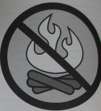
“no.” Notice that the icon falls apart, or is at least greatly weakened, if you place the campfire on top of the slashed circle. This is a good indication that there is a relationship communicated between these two icons through the who’s-on-top graphical ordering.


Icons and Graphemes

Works created by a graphic designer can be considered a collection of graphical elements, each of which is known as a grapheme. For a design to be a “good” design, it is critical that the audience can tell the difference between each element and other possible graphemes in that location. It is also important that the elements can be found and interpreted quickly and that the correct ” message” is extracted. Detection. discrimination, and reaction time tasks can be used to objectively evaluate candidate graphemes and grapheme arrangements in there dimensions.

   Elements of an Icon

– Shape: Leaf, tree, sun, ocean, endangered animals, rain forest elements

– Color: Green

– Movement elements: Circular arrows (recycling, circle of life, etc.)

Graphemes that communicate concepts usually are called icons. Typical icons would be the commonly occurring symbols for male and female restrooms as well as the red “slashed circle” used to communicate “not” for whatever it overlays.


Jedlička, W. (2010) Sustainable graphic design. New Jersey: John Wiley & Sons, Inc.

Gerd Arntz Graphic Designer

Gerd Arntz (1900-1988), born in a German family of iron manufactures, applied Bildung. He decides early in his life to take a different course and become an artist. During his career, Arntz designed around 4000 different pictograms, or Signaturen as they were called by Arntz and Neurath, and abstracted illustrations, or Leitbilder, for this system.

Ed Annink, which is the editor of the book, explained:

In today’s globalized and inextricably interwoven world, in which many cultures and subcultures live and work together, images can contribute to efficient and informative communication.

Pictograms: a view from the drawing board, or, what I learned from Otto Neurath and Gerd Arntz (and jazz)

by Nigel Holmes

When Otto Neurath called his International System of Typographic Picture Education (Isotype) a “helping language” (rather than a  complete visual substitute for a written language), he was suggesting what today is taken for granted in this field: words and pictures together make better explanations than words alone, or picture alone.

x4

Marie Neurath and others have proposed that certain pictorial symbols should be agreed upon and then left unchanged, making a kind of universal language. That could have advantages in such places as airports*, but I think there should be individual visual languages, just as I would preserve foreign spoken and written.

*The world’s airports may in fact be moving toward some standardization of icons – at least of wayfinding icons. The Dutch designer Paul Mijksenaar is leading the field in helping travelers find their way around more efficiently. You can see his clear, simply color-coded work in action at JFK Airport in New York, and at Schiphol Airport in Amsterdam, among others.

JFK Airport Terminal Map

Refer sign at Schiphol


The picture/word mix

While some airport and traffic sign systems aspire to form a wordless international language, most of the time (when it comes to explaining things, at least) it’s a combination of pictures and words that work best.

Neurath believed that a symbol should represent only what a thing looks like, not what the word for it sounds like.

Now that the world is becoming one big, undifferentiated culture, a little movement in the other direction, towards preserving differences, might be a relief.

x5 x6 x7

Does the ‘OK’ hand sign mean the same thing all over the world?


Annink, E. and Bruinsma, M. (2010) Gerd arntz graphic designer. Rotterdam: 010 Publishers

World Without Words

IMG_0059

Deviations from standard road signs

While global corporations are able to enforce absolute conformity in their own systems of signs and insignia the world over, there is no universal guardian of signs that convey other, arguably more important information. These ‘men at work’ road signs from around the world highlight the cultural diversity to be found in the application of a widely accepted graphic standard. The stoop or straight back, the broad or emaciated trunk, the size of the mound and the effort being applied to it – nothing is quite the same in any two places.

IMG_0061

Tsunami warning sign system

A growing, more mobile population is one more vulnerable to disaster, we are told by the developers of Japan’s new tsunami warning sign system. You can see their point. Go for a holiday on Shikoku Island and you might not realize that every 100 years earthquakes trigger devastating tidal waves several storeys high. Signboards at the railway station and the harbour inform the visitor of the hazard and of the warning and evacuation system. Pictograms are combined, mirroring kanji (Chinese character) formation, to create visual phrases and wordless directions. Not great for the tourist industry, maybe, but at least the tourists will know where to take cover.

IMG_0063

Smileys or ’emoticons’

The original email ‘smiley’ was conceived in the early 1980s as a way of using keyboard characters to indicate the tone of a text comment, or the state of mind of the sender. It has mutated into a visual vocabulary, incorporating ever more obscure additions. The ’emoticons’, as it is sometimes known, is evidence of individuals wishing to express themselves visually. It will become obsolete as computing power increases, but could be replaced by clip art of much greater variaty and finish, allowing users to weave together text and pictures as they type, in more integrated fashion.

IMG_0066

Storytelling by signs

These ranged from the amusing (signs that warned of ‘fairies’, ‘blobs’ and ‘snails’, or replaced the exclamation mark [danger] sign with other, more equivocal punctuation marks), to the mystifying (ancient Celtic and Tibetan symbols).

‘The red triangle is a sort of window into a world of authority. When a driver sees a black symbol on  a white background in a red triangle on a pole by the side of the road, their mind automatically switches into a receptive state. Imagine if we were to spray symbols on to walls, graffiti-style.


Evamy, M. (2003) World without words. London: Laurence King Publishing Ltd

Collier’s Rules for Desktop Design and Typography

IMG_0001

According to Collier (1991, p.83) Icons, whether purely graphical or incorporating words, can identify different chapters of a book or sections of a magazine, or introduce warnings or additional information in a manual. They mimic the visual interface provided by computers like the Macintosh and the wordless symbols used by transport authorities.

x1x3 x2

Images can replace words, for example this telephone icon which could introduce a phone number or additional information.

Collier, D. (1991) Collier’s rules for desktop design and typography. London: Addison-Wesley

Victorian Era

Source: http://victorianeracnr.blogspot.co.uk/2011/01/fashion.html

VICTORIAN FASHION

Women wore a variety of colours for their stockings and dresses.

Dresses and stockings undergarments were cut in a style to show off the figure in a modest way.

SHOES

Boots and shoes were almost always worn with heels and pointed or squared toes.

HATS

However, in the later years, hats became a symbol of style statement and authority.

For men, the top hat or the tall silk hat was generally worn for formal days and evening wear.

Shawls, cloaks, mantles, scarves and little aprons were also accessories.

Gloves and parasols were popular.

Large brooches were worn at the throat and large and small earrings were also worn.

The use of fans was also very common.

Boas made of feathers or fur were also very big.

MAKEUP

About the makeup of this time, women wanted to look like as fragile ladies.

They compared themselves to delicate flowers and emphasized their delicacy and femininity.

They always wanted to look pale and interesting.

HAIRSTYLES

Hair was parted down the middle, curled or braided, then tied or pinned back.

Only in informal occasions we can see the Victorian lady leaving her hair fall loose around her shoulders.

Bangs made their debut around 1880. Women began to use hot irons to wave their hair or add ringlets to it.

When Queen Elizabeth died in 1901 her styles died with her. The XX th century brought simpler fashions. Women’s fashions changed considerable with the rise in feminism in the XX th century.

Meet mum Christine Edun who shuns the modern world in favour of 1940s glamour

Source: http://www.liverpoolecho.co.uk/lifestyle/fashion/meet-mum-christine-edun-who-4829587

“It started off as an interest in the Victorian age but moved to the 40s”

"I’m just very fond of the 40s" says Christine Edun from Formby

“I’m just very fond of the 40s” says Christine Edun from Formby

Christine, 55, from Formby is passionate about the 40s, and indulges a by-gone era in everything, from the way she dresses to the way she lives.

She and husband, Ray, regularly go to dances where they do the lindy hop and the jive; and Christine is far more at home with her hair in victory rolls and taking a turn in a tea dress rather than in jeans and a T-shirt..

“I think it is because there was a great deal of diversity and we were struggling as a country, but we came out of a depression and we managed. I love the concept of the 40s and 50s, the gentility of the period and overcoming adversity.

Christine Edun from Formby in her period clothing

Christine Edun from Formby in her period clothing

“Forties fashion was ladylike and feminine. Even the utility clothing during the war and post war was well made.

“But, while they wore combinations and knitted underwear in the week, their ‘best’ underwear was embroidered by hand, and the delicate stitches were unbelievable. The women looked after it and they would wash it by hand the moment they returned home after a night out.

“They would while away the hours in the bomb shelters during raids sewing folders in which to keep their stockings.

Fashion and music in Liverpool

Source: http://www.liverpoolmuseums.org.uk/conservation/exhibitions/mellina/fashion/

An antidote to the grim realities of life lay in the city’s vibrant music and fashion scenes. For teenagers facing life on the dole or a wage of less than £20 per week, they offered an escape route. Dressing up, going out and belonging to one of the many ‘style tribes’ gave many young people a sense of purpose and a creative focus. They lived for the weekend and the chance to express themselves through their musical and fashion tastes. A few of Mellina’s photographs of different styles from the exhibition can be seen in the image gallery below.

There was a range of sub-cultures to choose from, but the punk, Rockabilly, New Romantic and emerging Goth scenes were the most prominent during these years. Followers of these musical scenes had their own distinct look and fashion sense, but they could not be bought ready-made. They were carefully put together and developed, from second-hand clothes shops, army surplus stores and a small number of specialist retailers, to produce an individual outfit.